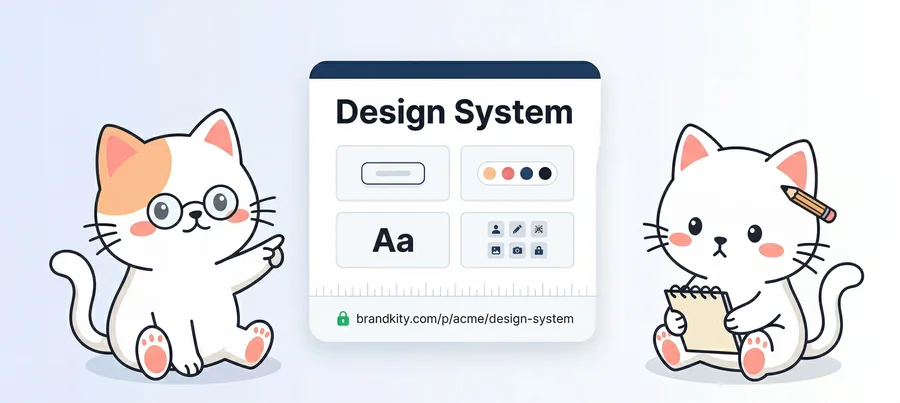
Design System Documentation
Document design tokens, component guidelines, and visual standards in a shareable BrandKit anyone on the team can reference.
The challenge
Design systems are only useful when people can find, understand, and actually apply them. Figma libraries solve the tools problem, but they don't help marketers, developers, or copywriters understand usage rules, spacing conventions, or which logo variant to use when. Documentation in Notion gets stale. Confluence pages get abandoned. The chasm between the system and its users keeps growing.
The solution
BrandKity sits alongside your design tools as the human-readable, shareable reference layer. Document colour tokens, type scales, and logo variants in a structured BrandKit that anyone on the product, marketing, or engineering team can reference — no Figma access required.
Key features
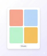
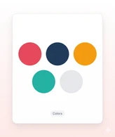
- Colour blocks with exact token names, hex values, and usage context
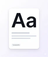
- Type scale documentation with live font previews and size references
- Logo usage do/don't guidance with visual examples and downloadable files
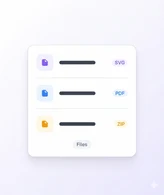
- Asset packages for developers and marketers with one-click downloads
- Link directly from Figma, Notion, or your internal wiki to specific BrandKit sections
- Always in sync with your actual system — update the BrandKit, not the docs
So, how does BrandKity work?
Create your BrandKit
Pick a template, add your accent color, and give your kit a name. Your BrandKit is ready in seconds.
Add your brand blocks
Add logos, colors, fonts, visuals, and files in one BrandKit.

Publish and share
Launch your BrandKit and share one clean, branded link.


Your brand deserves
one home.
Start sharing everything in one link. Free — no credit card required.